[W4-M] Presentation
1 Waking up
I woke up at around 6:30am, and went to gym. I know right? I finally managed to do that! ..anyways, that meant I was way too tired for the presentation and needed a solution. My presentation was at 3pm, and I was feeling way too drowsy at 10:30am ish, so had a nap (didn't finish preparing the last few slides at this point). Then I missed my 15 min standup meeting (at 11:45am), and woke up at like 12:09am. Lol they didn't mind but I was thinking to make up for that with a good presentation (dev team was invited, including my buddy and associate product director).
2 Learnings
It was a cool experience!
All the devs team turned up, which was nerve-breaking, but at the same time I enjoyed it since I prepared for it pretty well (at least I hope I did!). I was scheduled for another session with UX team (today was with just my dev team) as a follow up to this session, so I think that means I did well enough to convince that my findings are relevant and are useful!
Also this marks my first workplace presentation. I was exploring how Storybook (JS based tool) can be used to create and store design system. 40 minutes is pretty exhausting, but finishing it successfully is the reward.
some aha moments and learnings I had on the way:
- what u are digging into might not carry much significance, so frequently check with ur mentor to see if you are looking into the right thing (at minimum once in two days). otherwise you will be out of the loop
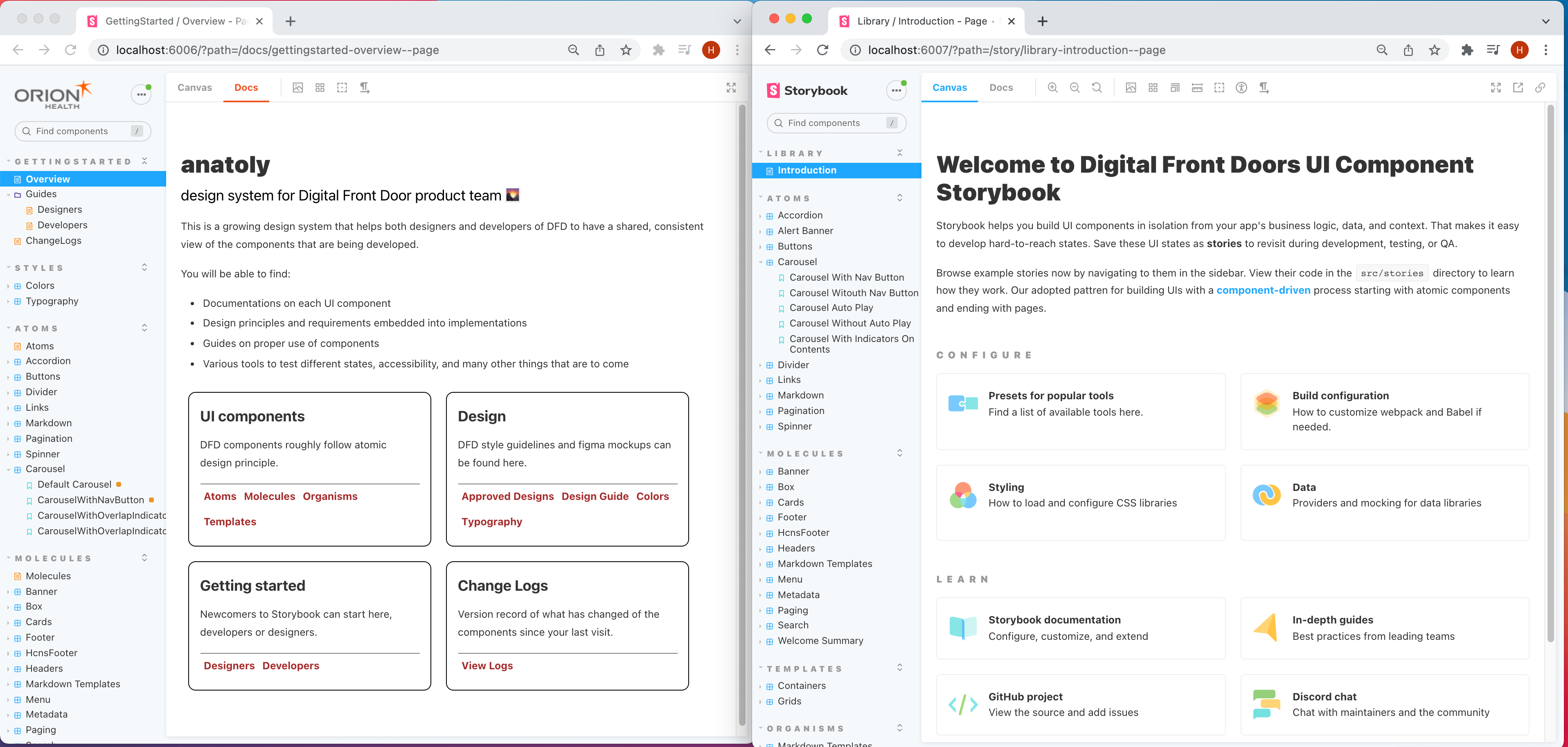
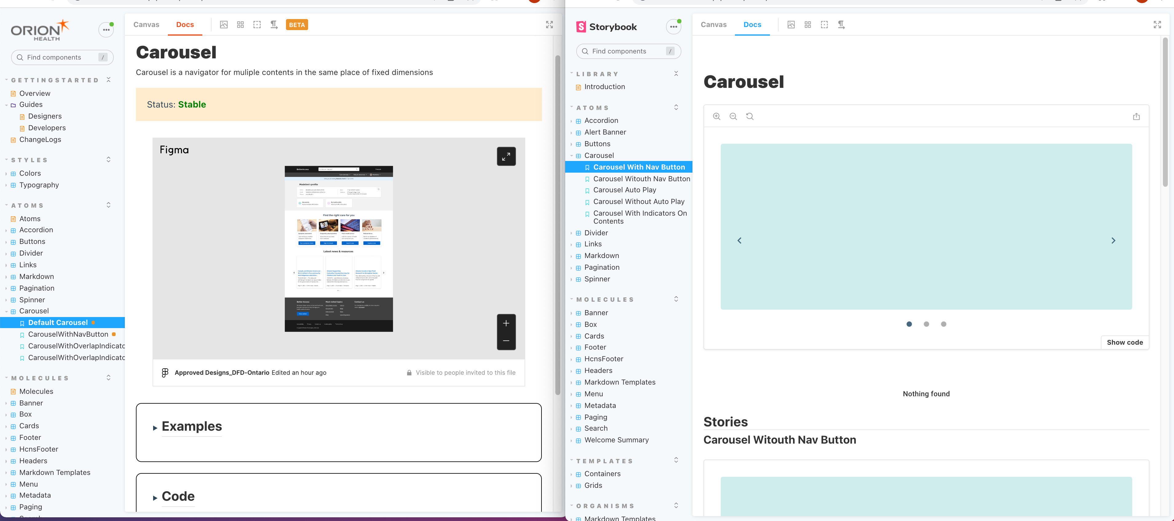
- focus efforts on exploring things that carry most benefits, and go above and beyond basic implementation. for example, documentation was something I focused a lot of my time on, using MDX to leverage most of Storybook capabilities & and iframing figma. I went on to create a hierarchical linkage between docs, so it is much easier to navigate across pages of docs for each component - the purpose of design system is to provide a single source of truth between UX/UI and dev team, and having effective documentation is important. Paid attention to details like navigation and indexing.
- initial exploration is important (it is called TA - technical analysis), seeing what things are implementable - document how things can be implemented
- spread your presentation preparation across a few days - write notes (viewable from presenter view) for each slide because you will need it (i saw all the good lecturers do that too - and use bullet points actively on slides to minimise visual overhead
- latex beamer template is a really good presentation format - focus on tangible benefits that are understood by various stakeholders as you will present to nontechnical person too - but prepare it with technical depth (eg how much technical overhead is there to switch from current to proposed approach)
- to do this, your TA and example should be robust and comprehensive enough.
- reiterate the same theme over and over (usually an ultimate goal - for me it was collaboration between ux/ui and devs), it really makes the presentation feel well woven
- I think showing workflow with current approach and comparing it with new approach made it really stick (might do that for next session with UX too)
- figma really seemed to be liked, as it really digs into that notion of single source of truth
- showing what changes had to be made to the code also appealed to the audience who were all technical. showing how little changes/boilerplates needed to be added was key to selling it I think
3 Presentations (demo not included)


Use Prèsenter.app for presenting with latex. It's soo useful

4 Latex
\documentclass[]{beamer}
\usepackage{tikz}
\usepackage{listings}
\usepackage{color}
\usepackage{textcomp} % for upquote
\usetheme{Copenhagen}
\usecolortheme{default}
\usepackage{textcomp}
% for images
\usepackage{graphicx}
\graphicspath{{./img/}}
% for presentation
\usepackage{pgfpages}
\setbeameroption{show notes on second screen}
%
% ECMAScript 2015 (ES6) definition by Gary Hammock
%
\lstdefinelanguage[ECMAScript2015]{JavaScript}[]{JavaScript}{
morekeywords=[1]{await, async, case, catch, class, const, default, do,
enum, export, extends, finally, from, implements, import, instanceof,
let, static, super, switch, throw, try},
morestring=[b]` % Interpolation strings.
}
%
% JavaScript version 1.1 by Gary Hammock
%
% Reference:
% B. Eich and C. Rand Mckinney, "JavaScript Language Specification
% (Preliminary Draft)", JavaScript 1.1. 1996-11-18. [Online]
% http://hepunx.rl.ac.uk/~adye/jsspec11/titlepg2.htm
%
\lstdefinelanguage{JavaScript}{
morekeywords=[1]{break, continue, delete, else, for, function, if, in,
new, return, this, typeof, var, void, while, with},
% Literals, primitive types, and reference types.
morekeywords=[2]{false, null, true, boolean, number, undefined,
Array, Boolean, Date, Math, Number, String, Object},
% Built-ins.
morekeywords=[3]{eval, parseInt, parseFloat, escape, unescape},
sensitive,
morecomment=[s]{/*}{*/},
morecomment=[l]//,
morecomment=[s]{/**}{*/}, % JavaDoc style comments
morestring=[b]',
morestring=[b]"
}[keywords, comments, strings]
\lstalias[]{ES6}[ECMAScript2015]{JavaScript}
% Requires package: color.
\definecolor{mediumgray}{rgb}{0.3, 0.4, 0.4}
\definecolor{mediumblue}{rgb}{0.0, 0.0, 0.8}
\definecolor{forestgreen}{rgb}{0.13, 0.55, 0.13}
\definecolor{darkviolet}{rgb}{0.58, 0.0, 0.83}
\definecolor{royalblue}{rgb}{0.25, 0.41, 0.88}
\definecolor{crimson}{rgb}{0.86, 0.8, 0.24}
\lstdefinestyle{JSES6Base}{
backgroundcolor=\color{white},
basicstyle=\ttfamily,
breakatwhitespace=false,
breaklines=true,
captionpos=b,
columns=fullflexible,
commentstyle=\color{mediumgray}\upshape,
emph={},
emphstyle=\color{crimson},
extendedchars=true, % requires inputenc
fontadjust=true,
frame=single,
identifierstyle=\color{black},
keepspaces=true,
keywordstyle=\color{mediumblue},
keywordstyle={[2]\color{darkviolet}},
keywordstyle={[3]\color{royalblue}},
numbers=left,
numbersep=5pt,
numberstyle=\tiny\color{black},
rulecolor=\color{black},
showlines=true,
showspaces=false,
showstringspaces=false,
showtabs=false,
stringstyle=\color{forestgreen},
tabsize=2,
title=\lstname,
upquote=true % requires textcomp
}
\lstdefinestyle{JavaScript}{
language=JavaScript,
style=JSES6Base
}
\lstdefinestyle{ES6}{
language=ES6,
style=JSES6Base
}
%%%%%%%%%%%%%%%%%%%%%%%%%%%%%%%%%%%%%%%%%
% TITLE PAGE %%%%%%%%%%%%%%%%%%%%%%%%%%%%%%%%%
\title{Design System with Storybook}
\author{Hajin Kim \newline (Orion Health DFD Intern)}
\date{\today}
%%%%%%%%%%%%%%%%%%%%%%%%%%%%%%%%%%%%%%%%%%%%
\begin{document}
\frame{\titlepage}
\note{Hi good to have you all, and thanks for joining me in this demo. For the past few weeks, I've done some investigations around how to use Storybook to create and store a design system. I tried to focus on two features more than anything else, and that's because I found those two to be the most relevant. Those are documentation and deployment, which I'll soon talk about.}
%%%%%%%%%%%%%%%%%%%%%%%%%%%%%%%%%%%%%%%%%%%%
\begin{frame}
\frametitle{Storybook \& Design System}
Goal: leveraging Storybook to create a design system.
\vspace{5mm}
Storybook helps to construct design system through:
\begin{itemize}
\item Browser rendering of UI components
\item Testing tool (Snapshot testing)
\item Addons (Accessibility, Measure, Outline, \textbf{Figma})
\item \textbf{Documentation (MDX)}
\item \textbf{Deployment of Storybook (Chromatic)}
\end{itemize}
\end{frame}
\note[itemize]{
\item The goal here is to create a design system. Before getting into details about what design system is, here's what Storybook has to offer.
\item Browser rendering renders UI components so what you see is what you get
\item We already use snapshot testing, which is used to detect visual regression against a base snapshot
\item Storybook has marketplace for some addons like the ones up here.
\item There's documentation and deployment, which are also two of main features that Storybook offers.
\item So in short, Storybook is a comprehensive tool that helps us to assess an implemented UI component thoroughly. Browser rendering of isolated components is just one feature.
}
%%%%%%%%%%%%%%%%%%%%%%%%%%%%%%%%%%%%%%%%%%%%
\begin{frame}<3>
\frametitle{Design system}
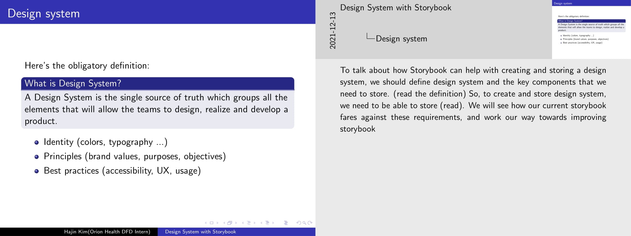
Here's the obligatory definition:
\begin{block}{What is Design System?}
A Design System is the single source of truth which groups all the elements that will allow the teams to design, realize and develop a product.
\end{block}
\begin{itemize}
\item<1-> Identity (colors, typography ...)
\item<2-> Principles (brand values, purposes, objectives)
\item<3-> Best practices (accessibility, UX, usage)
\end{itemize}
\end{frame}
\note{To talk about how Storybook can help with creating and storing a design system, we should define design system and the key components that we need to store. (read the definition) So, to create and store design system, we need to be able to store (read). We will see how our current storybook fares against these requirements, and work our way towards improving storybook }
%%%%%%%%%%%%%%%%%%%%%%%%%%%%%%%%%%%%%%%%%%%%
\begin{frame}
\frametitle{In the beninging}
Where did we start?
\begin{itemize}
\item UI components are dynamically rendered in Storybook for interactive manual testing
\item Each UI component was grouped into categories of Atomic Design
\item Snapshot testings are used
\item \lstinline{yarn start} locally builds storybook
\end{itemize}
\end{frame}
\note{When I first started this ticket, here's what I noticed from the current storybook. }
%%%%%%%%%%%%%%%%%%%%%%%%%%%%%%%%%%%%%%%%%%%%
\begin{frame}
\frametitle{Problems}
No documentations at all
\begin{itemize}
\item What's the best practice? What UX principles does it satisfy? What are the usecases of this component? How can it be used in code? What's the status of this UI component? (Production ready? Beta?)
\item devs to devs, devs to UI/UX, UI/UX to UI/UX
\end{itemize}
\vspace{5mm}
Locally built Storybook
\begin{itemize}
\item Not accessible until push \textrightarrow pull \textrightarrow build storybook \textrightarrow run on localhost
\item again - hinders communication, UI/UX left out
\end{itemize}
\end{frame}
%%%%%%%%%%%%%%%%%%%%%%%%%%%%%%%%%%%%%%%%%%%%
\begin{frame}
\frametitle{Solutions}
No documentations at all
\begin{itemize}
\item Something that's easy to index into
\item Doc for each component, with controls on props
\item Shows Figma mockup, document usage/code, use cases (different states)
\end{itemize}
\vspace{5mm}
Locally built Storybook
\begin{itemize}
\item Keeps storybook up to date for important updates
\item Automatically ping people when something about storybook changes
\item Allow for visual regression testing, comments, reviews
\end{itemize}
\end{frame}
%%%%%%%%%%%%%%%%%%%%%%%%%%%%%%%%%%%%%%%%%%%%
\begin{frame}
\frametitle{Demo}
\begin{itemize}
\item MDX (documentation)
\end{itemize}
\end{frame}
\note[itemize]{
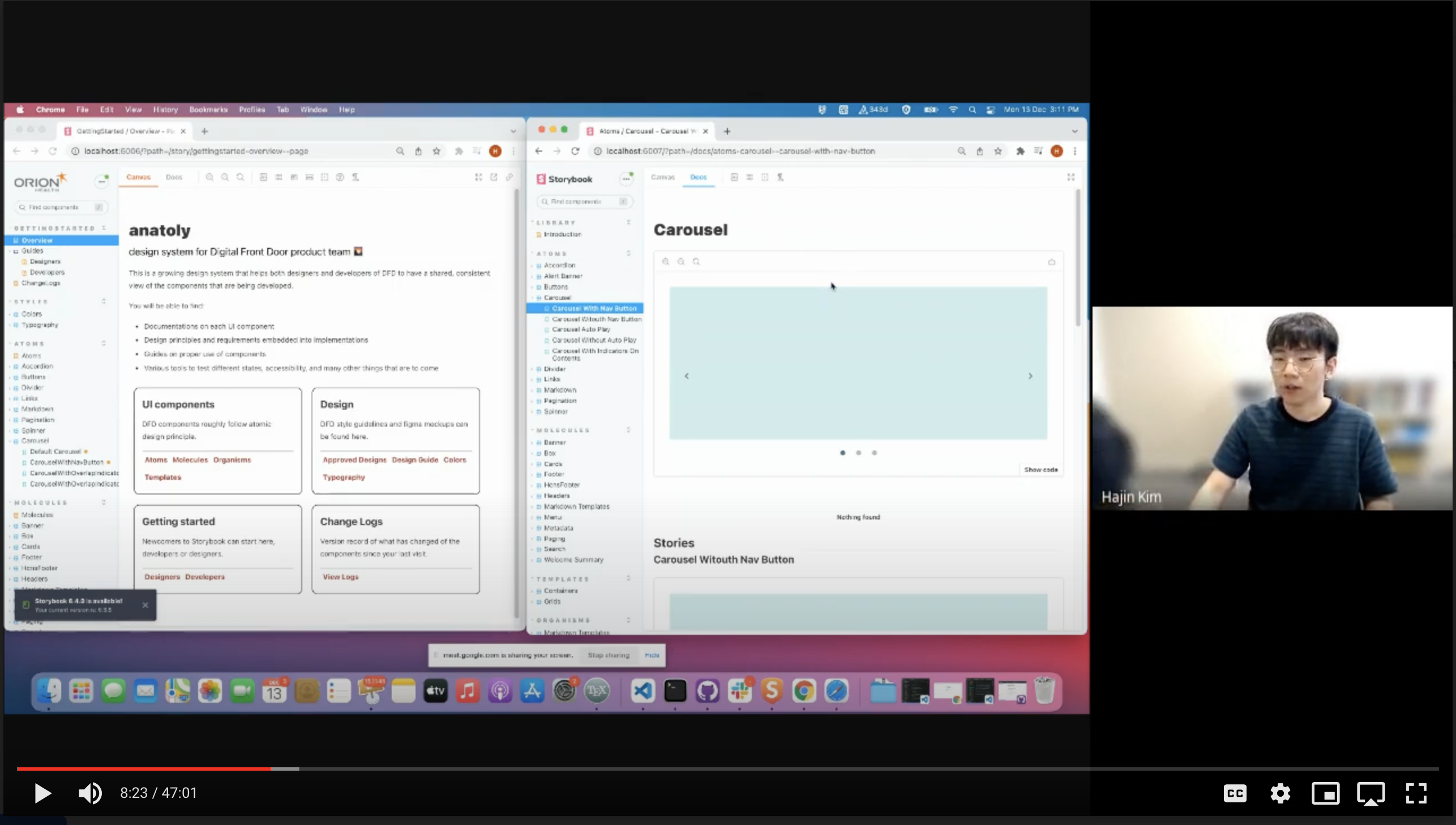
\item usecase: I'm a UX designer, want to look at carousel.
\item Don't know much about atoms/molecules, need to do linear search on left pane
\item Information not too helpful, no status, no best practice, no UX principle documentation, no usecase, need to look at figma to compare
\item controls
}
%%%%%%%%%%%%%%%%%%%%%%%%%%%%%%%%%%%%%%%%%%%%
\begin{frame}[fragile]
\frametitle{Controls}
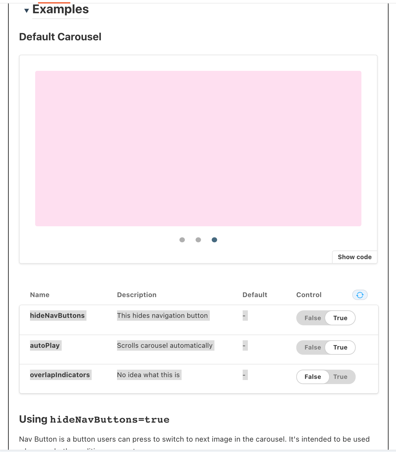
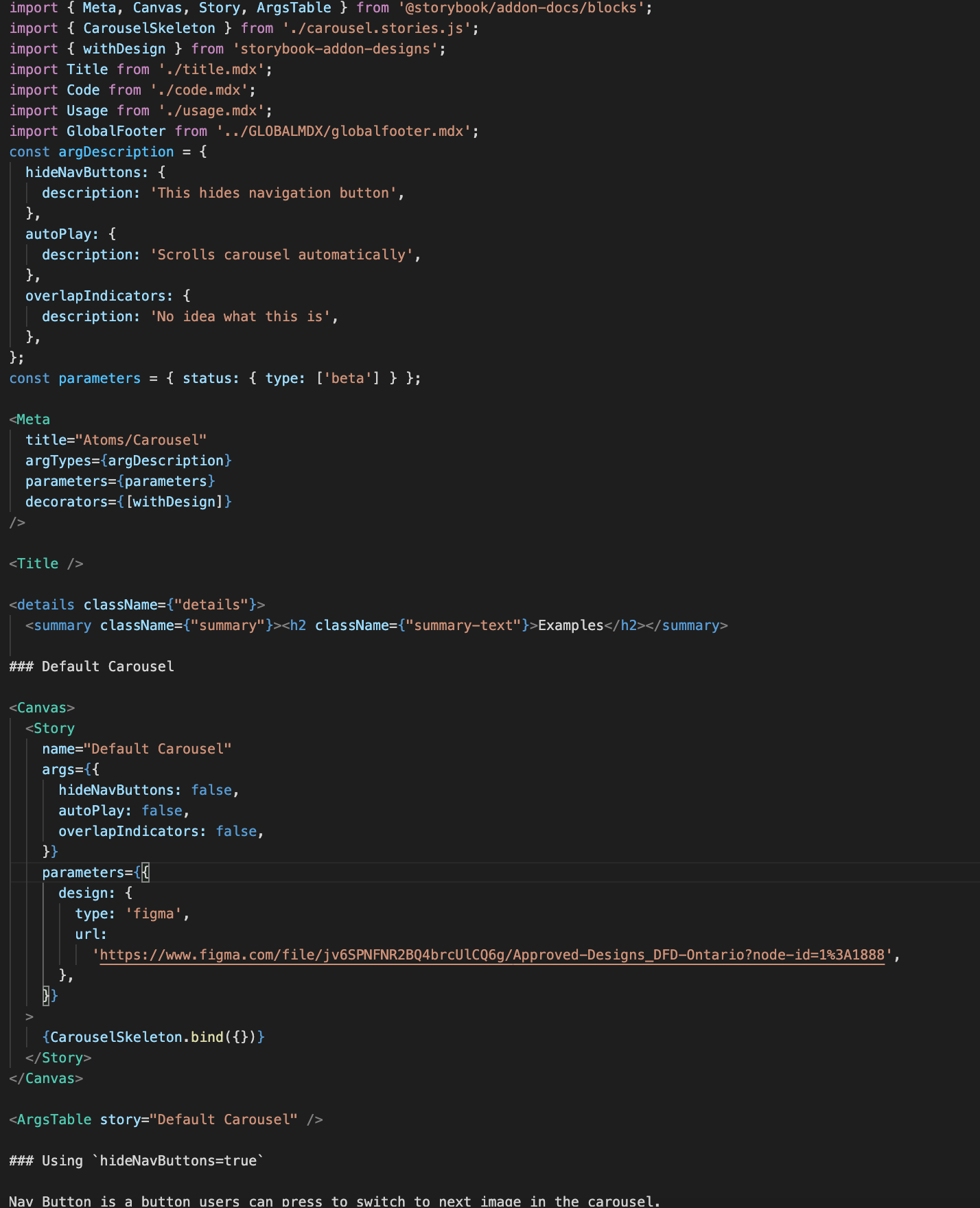
'Controls' is a Storybook feature. Enabled by dynamic argument binding
\begin{lstlisting}[style=ES6, basicstyle=\small, caption={Current version}]
// ...imports
export const DefaultCard =()=><Card text={"This is card text"} />
export const ImportantCard =()=><Card text={"This is card text"} important={true} rounded={true} />
\end{lstlisting}
\begin{lstlisting}[style=ES6, basicstyle=\small, caption={Dynamic argument binding}]
// ... imports
const params = { text: "This is text", important: false, rounded: false}
const CardTemplate = args => <Card {...args} />
export const DefaultCard = CardTemplate.bind({})
DefaultCard.args = params
export const ImportantCard = CardTemplate.bind({})
ImportantCard.args = {...params, important:true, rounded: true}
\end{lstlisting}
\end{frame}
\note{I also want to briefly talk about code as well, because to enable controls, we need to do some tweaks on the current code}
%%%%%%%%%%%%%%%%%%%%%%%%%%%%%%%%%%%%%%%%%%%%
\begin{frame}
\frametitle{Controls}
Very useful because:
\begin{itemize}
\item Toggle props in Storybook (true \textrightarrow false, "This is text" \textrightarrow "This is a long text")
\item Reusable template
\item As you will see soon, this makes MDX much more intuitive to use (define stories in MDX)
\end{itemize}
\end{frame}
%%%%%%%%%%%%%%%%%%%%%%%%%%%%%%%%%%%%%%%%%%%%
\begin{frame}<5>
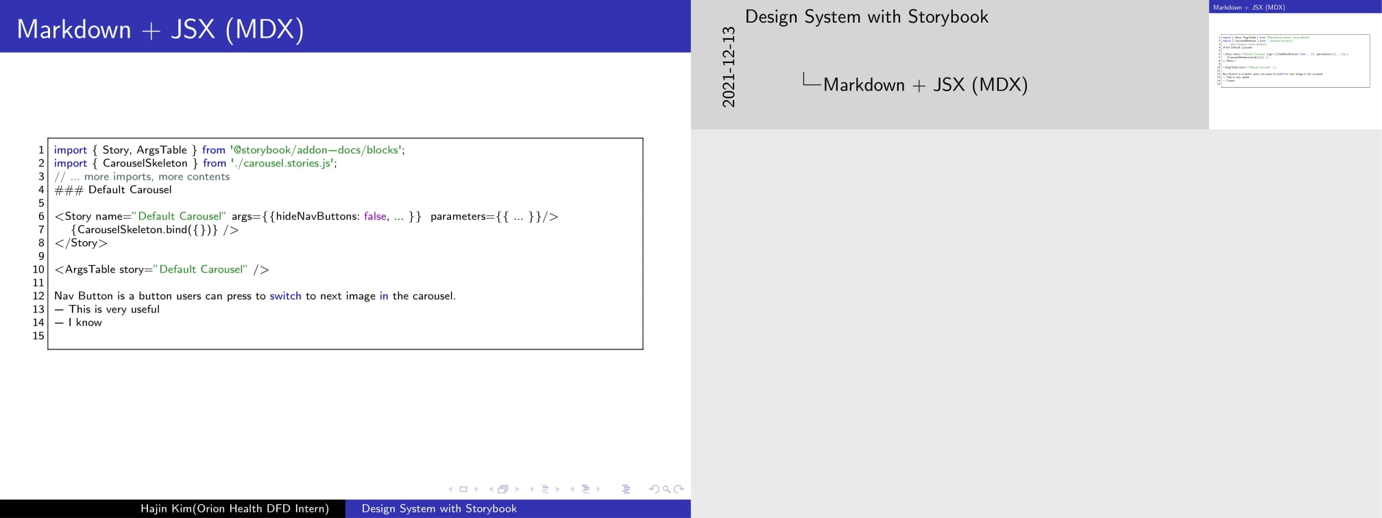
\frametitle{Markdown + JSX (MDX)}
\begin{itemize}
\item<1-> You can define stories as you write documentation
\item<2-> Special tags that map 1 to 1 to \lstinline{export default {}}
\item<3-> Amazing: you can write documentation and define stories in the same file, creating a logical flow in documentation.
\item<4-> You can import mdx and embed it into another mdx
\item<5-> You can link to another mdx, allowing for natural and easy navigation/indexing
\end{itemize}
\end{frame}
\note{}
%%%%%%%%%%%%%%%%%%%%%%%%%%%%%%%%%%%%%%%%%%%%
\begin{frame}[fragile]
\frametitle{Markdown + JSX (MDX)}
\begin{lstlisting}[style=ES6, basicstyle=\tiny]
import { Story, ArgsTable } from '@storybook/addon-docs/blocks';
import { CarouselSkeleton } from './carousel.stories.js';
// ... more imports, more contents
### Default Carousel
<Story name="Default Carousel" args={{hideNavButtons: false, ... }} parameters={{ ... }}/>
{CarouselSkeleton.bind({})} />
</Story>
<ArgsTable story="Default Carousel" />
Nav Button is a button users can press to switch to next image in the carousel.
- This is very useful
- I know
\end{lstlisting}
\end{frame}
%%%%%%%%%%%%%%%%%%%%%%%%%%%%%%%%%%%%%%%%%%%%
\begin{frame}<3>
\frametitle{Documentation benefits for Design Systems}
\begin{itemize}
\item<1-> Identity (colors, typography ...) \textbf{are now documented}
\item<2-> Principles (brand values, purposes, objectives) \textbf{are now documented}
\item<3-> Best practices (accessibility, UX, use cases) \textbf{are now documented}
\end{itemize}
... all alongside each UI components
\end{frame}
\note[itemize]{
\item You can see that MDX really provides a neat way to document these stuffs effectively and comprehensively. And storybook gets rid of a lot of boilerplates needed to set these documentations up
\item furthermore, integration of figma frames really makes comparison between mockup and UI feasible.
}
%%%%%%%%%%%%%%%%%%%%%%%%%%%%%%%%%%%%%%%%%%%%
\begin{frame}
\frametitle{Demo}
\begin{itemize}
\item Chromatic (deployment)
\item<2-> ... demo replaced with screenshots
\end{itemize}
\end{frame}
\note[itemize]{
\item Make sure to cover the following:
\item
}
%%%%%%%%%%%%%%%%%%%%%%%%%%%%%%%%%%%%%%%%%%%%
\begin{frame}
\frametitle{Demo}
Prerequisites:
\begin{itemize}
\item Chromatic project is set up (gives project token)
\item Bamboo CI includes `yarn chromatic --project-token=...` in build process
\end{itemize}
\end{frame}
%%%%%%%%%%%%%%%%%%%%%%%%%%%%%%%%%%%%%%%%%%%%
\begin{frame}
\frametitle{Demo}
Push a commit that causes visual regression (or can be a manual build of Storybook at any moment then push to Chromatic using `yarn chromatic --project-token=...`
\vspace{5mm}
\includegraphics[width=\textwidth]{chromatic-1}
\end{frame}
%%%%%%%%%%%%%%%%%%%%%%%%%%%%%%%%%%%%%%%%%%%%
\begin{frame}
\frametitle{Demo}
Bamboo CI picks up this change
\vspace{5mm}
\includegraphics[width=\textwidth]{chromatic-2}
\end{frame}
%%%%%%%%%%%%%%%%%%%%%%%%%%%%%%%%%%%%%%%%%%%%
\begin{frame}
\frametitle{Demo}
Chromatic detects visual regression in the new storybook
\vspace{5mm}
\includegraphics[width=\textwidth]{chromatic-3}
\end{frame}
%%%%%%%%%%%%%%%%%%%%%%%%%%%%%%%%%%%%%%%%%%%%
\begin{frame}
\frametitle{Demo}
Get notified via Slack
\vspace{5mm}
\includegraphics[width=\textwidth]{chromatic-4}
\end{frame}
%%%%%%%%%%%%%%%%%%%%%%%%%%%%%%%%%%%%%%%%%%%%
\begin{frame}
\frametitle{Demo}
Chromatic dashboard
\vspace{5mm}
\includegraphics[width=\textwidth]{chromatic-5}
\end{frame}
%%%%%%%%%%%%%%%%%%%%%%%%%%%%%%%%%%%%%%%%%%%%
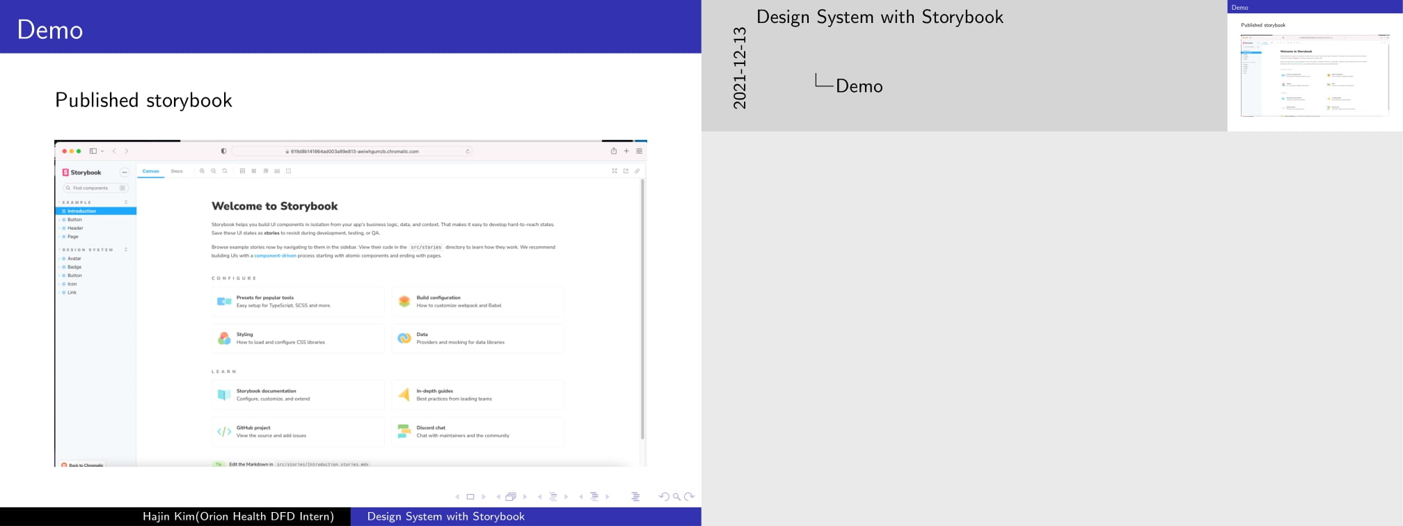
\begin{frame}
\frametitle{Demo}
Published storybook
\vspace{5mm}
\includegraphics[width=\textwidth]{chromatic-6}
\end{frame}
%%%%%%%%%%%%%%%%%%%%%%%%%%%%%%%%%%%%%%%%%%%%
\begin{frame}
\frametitle{Demo}
Visual review
\vspace{5mm}
\includegraphics[width=\textwidth]{chromatic-7}
\end{frame}
%%%%%%%%%%%%%%%%%%%%%%%%%%%%%%%%%%%%%%%%%%%%
\begin{frame}
\frametitle{Benefits}
\begin{itemize}
\item Only need to run yarn chromatic to build and deploy storybook, which makes it really easy to distribute up to date storybook
\item UX/UI team will really like the fact that they can access storybook from their machine without having to set up yarn and pulling project from the repository
\item Intuitive, consistent, robust interface to make a comment on each component, whereas sending screenshots or demo will be significantly slower and hard to track.
\item Any visual regression can be requested for review
\end{itemize}
Disadvantage:
\begin{itemize}
\item Deployment to external platform might not be appealing
\item You need to pay if you exceed free tier
\end{itemize}
\end{frame}
%%%%%%%%%%%%%%%%%%%%%%%%%%%%%%%%%%%%%%%%%%%%
\begin{frame}
\frametitle{Proposal}
Use MDX:
\begin{itemize}
\item Documentation for each component/story
\item Cohesive flow to presentation of different stories of each component
\end{itemize}
Use Chromatic:
\begin{itemize}
\item Easy deployment of storybook, that is accessible for all the registered collaborators.
\item Visual review is built into this tool, which encourages far more communication
\end{itemize}
\end{frame}
\note{
I covered several aspects of Storybook, in particular how Storybook provides tools relevant to documentation and deployment, which ultimately makes up a more robust design system. I've also discussed how it might benefit the communication between UX/UI team and dev team. These are tools that will not only benefit UI/UX team but also the developers.
}
\end{document}
5 some snippets from demos


Some snaps from demos